
Короткий зміст
Ця стаття пояснює, які помилки в мокапах знижують продажі на Etsy і як правильно показувати товари на перших фото, у відео та в додаткових зображеннях. Авторка розбирає типові помилки для картин, принтів і футболок та дає практичні правила, як зробити мокапи більш реалістичними й конверсійними.
Головна ідея: хороший мокап не має відволікати від товару — він повинен допомагати покупцю швидко уявити, як річ виглядатиме в реальному житті.
Для кого ця стаття
- Для продавців на Etsy, які хочуть підвищити конверсію лістингів.
- Для художників і продавців картин, принтів і digital download.
- Для продавців футболок, одягу та print-on-demand.
- Для тих, хто використовує мокапи, відео та lifestyle-фото у своїх лістингах.
Суть статті
- Перші фото мають продавати товар, а не декор навколо нього.
- Явно штучний або грубий мокап знижує довіру і може різко погіршити конверсію.
- Товар повинен бути читабельним: розмір, колір, товщина, матеріал і контекст мають бути зрозумілими з фото.
- Мокап має відповідати сезону, стилю інтер’єру й цільовій аудиторії.
- Відео та фото повинні показувати саме той товар, який продається, а не сторонній приклад.
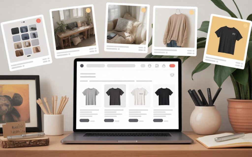
10 типових помилок у мокапах
Error 1: Season Mismatch
Let’s consider an example of such a mockup, which is sold on Etsy. Many pay attention: how cute the girl is, how well she sits on the bed, a wonderful T-shirt — here I will attach my design. But! This girl is not just sitting on a bed, but on a bed with pumpkins and full autumn decor. Such a girl is very suitable to use in October, September, during autumn holidays, maybe starting from August to showcase some products, but not to use her all year round. A person who wants to buy such a T-shirt in January may not even understand why they didn’t like this product — simply because it doesn’t match the season.
Error 2: Obvious Clumsy Mockup
Clumsy mistakes in mockups are when the photograph is very blurred, where it’s 100% obvious that it is a mockup. To such an extent that they’ve just taken a photo, not even cropped the frame, cut it roughly, and for any person, it’s immediately clear — the picture is “pasted on”. This greatly reduces conversion. They just took their cutout photo, an uninteresting picture, and slapped it everywhere. Then they wonder why the conversion rate is so low.
Error 3: Image Dissolves on a White Background
I understand — a white background is very cool, nice. But how ugly and wrong it looks when this picture dissolves into the white background. Of course, such a picture would probably look better on a different background.
Error 4: Confusing Sizes
It’s completely unclear — this is also a size error. It seems that this photo is vertical (portrait), but here it’s square. Maybe you’re selling a PNG that can be printed any way, but no sizes are shown regarding how it can be printed. Sometimes the sizes of paintings are shown in videos. But why do that in a video? It’s completely wrong — everything should have been shown in photos.
Error 5: Unattractive Frame and Background
The frame is very unattractive. The picture itself might be fine, but these photos greatly devalue it. With such a frame, with such a background. Of course, the conversion could be significantly increased if the mockups for this picture were improved.
Error 6: Mockup Distracts from the Product
When the mockup distracts too much attention. Pillows are very distracting. Pots with cacti — nice, but all grouped together, the girl gets lost in this background. Or, for example, the picture is placed on the floor. I understand that it may fit such an interior — white, modern, light, in the kitchen. But this is not the best place to show this picture.
Principle: When you look at a mockup, it should create a certain atmosphere, evoke a desire to buy this specific picture, and not attract attention to itself. There should be no reaction like “Oh, maybe I want to buy this vase” or “What a beautiful pillow”.
Error 7: Inappropriate Placement
Where do you think a person would want to hang such a picture? I see it can be hung in the corridor, in the living room, in the kitchen. But to be honest, I don’t see this picture in the bathroom. And I can definitely say that such a picture doesn’t suit a nursery. Even in terms of color scheme, it doesn’t match this style and space.
Error 8: Elements Blocking the Product
Why is there a cup blocking it? Unclear. Or why is there this bright green bush of artificial flowers, which are clearly non-natural, blocking the picture? No, this is far from the best solution.
Error 9: Inappropriate Video
Why is there a girl with a horse? This video is supposed to sell a completely different picture. I see this mistake very often: there’s a beautiful print, wonderful, which could be shown in interior shots, showing how it reflects light, how shiny the Christmas tree is, evoking the desire to buy a similar gift. The photos are good, but it’s a pity that the video doesn’t use this opportunity — instead, it shows a completely different picture.
Error 10: Product Blends with Background (T-shirts)
For a T-shirt, a white T-shirt on a white background is shown. It should be a black one! Such a photo, such a mockup will not sell this T-shirt — at least, this option definitely doesn’t work.
Examples of correct mockups

An example of a well and correctly displayed painting:
- We see the thickness of the canvas
- Side light reflects off the surface
- The background and everything around do not distract attention from the painting itself
- This is very successful and correct
The main thing for the buyer of the painting is that their expectations match reality:
- In what form will the painting arrive?
- How will I receive it?
- How will I open it?
- What thickness will the paper or canvas be?
- What quality will the print be?
- How will it look when I put it in a frame?
- How will it look when I hang it on the wall?
In other words, the buyer should easily imagine how the painting will look exactly in their interior, with their wall colors — this is very important.
Proper mockups for T-shirts
Here’s an example of a wonderful T-shirt with well-chosen models: three sisters or three brothers in T-shirts with texts — «I’m favourite!», «No, I’m loved!», «No, I am!»
This is the perfect example of a product that evokes emotion. It plays on the childhood rivalry between brothers and sisters — and anyone who has several children, or who grew up in such a family, will instantly recognize themselves in this.
Another good example: the text «How I look when I transform into a ninja» — followed by an image with a humorous «oops!» effect. This mockup immediately demonstrates the target audience, evokes a smile, and makes it easy to imagine oneself in this T-shirt.
Proper mockups for paintings
One of my favorite mockups is an interior with large white windows, light furniture that matches many styles. Since currently trending to sell sets of three pictures, especially prints, and where light reflections are visible — such mockups work best.
Recommendation: Use mockups that are easy to insert your images into. Some mockups are complicated to use, while others are very simple.
For example, Frame Mockup in Home Interior for $7, sold on Etsy — a great option with proper lighting and a cozy interior.
A very pleasing interior:
- Does not distract attention
- Has a light Christmas-New Year mood
- No excess red-green colors
- Comfortable light from bulbs
- Creates the full impression that this is not a mockup, but a real photo
Pay attention to ensure the frame matches the interior. Even if there are candles in front of it — they should not cover the picture but only add realism, as if it’s a live photograph, not a template.
Interesting frames:
- Round frames (currently very fashionable oval paintings)
- Frames with bows
- Frames in coquette style
Don’t forget: the frame is an important part of presentation. It also “sells” your picture.
The correct color scheme
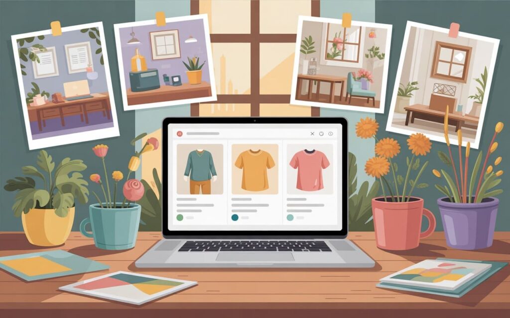
A very well-chosen mockup is when the color in the paintings matches the color of the interior of the person who might want to buy these paintings.
Light painting on a dark background:
- Appears brighter
- More noticeable
- The light falling from the window makes it more realistic
Very often, the painting should correctly match the style of the interior. Minimalist modern design quite appropriately suits this kind of picture. I cannot imagine hanging such a picture, for example, in a classic or traditional interior. Do not leave too much white space. The picture should not look empty on the wall. The picture would look better in a frame, not just empty.
Rules for successful mockups
For paintings and prints
- Show the thickness and quality — the buyer should see the thickness of the sheet, the print quality
- Use proper lighting — window light makes photos more natural
- Choose a color palette — the interior should match the style of the painting
- Do not block the product — decor should not distract from the painting
- Display in different sizes — if that is what you sell
- Match the interior style — minimalism to minimalism, classic to classic
- Use dark backgrounds — in 2025, it’s a trend for light paintings
- Proper frame — it sells your painting
For T-shirts and clothing
- Proper model — should match the target audience
- Contrasting background — do not show a white T-shirt on a white background
- Seasonality — autumn decor in the fall, not all year round
- Emotion and atmosphere — the buyer should imagine themselves in this item
General rules
- Do not use overtly noticeable mockups — they should look natural
- A mockup creates an atmosphere — it should not distract from the product
- Simplicity of insertion — use mockups where it’s easy to insert your image
- Video sells the product — do not show a different painting in the video
- Compliance with Etsy rules — the first photo should be your own (except POD)
Ознаки сильного мокапа
- Товар легко читається і не губиться на фоні.
- Освітлення виглядає натурально і підкреслює фактуру.
- Інтер’єр відповідає стилю товару і допомагає уявити його в реальному просторі.
- Рамка, модель або декор підсилюють подачу, а не змагаються з продуктом.
- Покупець розуміє розмір, формат і зовнішній вигляд товару ще до переходу в опис.
Чек-лист: як перевірити мокап перед публікацією
- Переконайтесь, що товар добре видно з першого погляду.
- Перевірте, чи фон не зливається з товаром.
- Оцініть, чи декор не відволікає від основного продукту.
- Переконайтесь, що мокап відповідає сезону й стилю товару.
- Покажіть розмір, товщину, формат або пропорції там, де це критично.
- Перевірте, чи відео і фото показують один і той самий товар.
- Підберіть інтер’єр, у якому покупець реально уявить цю річ.
- Окремо перевірте, чи перше фото відповідає правилам Etsy.
Часті питання
Які мокапи найчастіше знижують продажі на Etsy?
Які мокапи найчастіше знижують продажі на Etsy?
Найчастіше шкодять ті мокапи, де товар зливається з фоном, очевидно вставлений штучно, закритий декором або показаний у недоречному інтер’єрі. Такі помилки прямо розібрані у статті серед 10 типових проблем.
Що важливіше в мокапі: красивий фон чи сам товар?
Що важливіше в мокапі: красивий фон чи сам товар?
Найважливіший саме товар. Авторка прямо пояснює, що мокап має створювати атмосферу, але не повинен відволікати увагу від продукту. Якщо покупець дивиться на вазу, подушку чи декор, а не на товар, мокап працює погано.
Як правильно показувати картини та принти в лістингу?
Як правильно показувати картини та принти в лістингу?
Для картин важливо показати товщину полотна, якість друку, освітлення, розміри, відповідність інтер’єру і правильну рамку. Стаття окремо підкреслює, що покупець має легко уявити, як робота виглядатиме в його просторі.
Який мокап краще для футболки?
Який мокап краще для футболки?
Для футболок важливо, щоб був контрастний фон, правильна модель, відповідність сезону і емоція. У статті наведений приклад, що біла футболка на білому фоні не працює, а гарний мокап має одразу показувати цільову аудиторію та викликати емоцію
Чому відео в лістингу теж може шкодити конверсії?
Чому відео в лістингу теж може шкодити конверсії?
Тому що відео має продавати саме той товар, який бачить покупець у лістингу. У статті є приклад помилки, коли відео показує іншу картину, і це прямо названо невідповідним рішенням.
Що робити далі
Перегляньте 10 ваших найсильніших лістингів і перевірте перше фото, відео та мокапи за чек-листом із цієї статті. Якщо потрібна допомога з аналізом Etsy-магазину, ціннісної пропозиції або оформленням лістингів — зверніться до команди Western Bid.
